
RECORD LABELS//
ALMOST ALL MUSIC IS RELEASED UNDER THE NAME OF A RECORD LABEL.
Record labels are large or small companies that fund the production of music and advertising for an artist. A record label will pay the entire cost for production, marketing and promotion but expects the artist to return that amount of money from the royalties they receive before they start seeing any of the money themselves. So, if an album flops the record label looses out on money, bigger companies such as Universal or Sony can afford to do this however independent labels would struggle if the didn't break even.

Universal Music Group is a subsidiary of Vivendi studios and owns many different labels including EMI, Island Records and Def Jam Recordings. Due to being a large company who own various record labels they would sign successful and popular artists to make the most money. In terms of genre this is most likely to be pop music or music that is otherwise popular. Well known artists from UMG include Kanye West and Taylor Swift. They make $1.5 billion in revenue on average.
universal music group
UMG target a masse audience as they are a major record label, this is also connoted by their logo. their logo infers the global nature of their company and their overwhelming success.

creation records
Creation Records are a British label specialising in alternative music, it was key in the indie movement of the 1980's. It was started by Alan McGee who took out a loan of £1000 to put out "73 in 83" by The Legend! Their notable artists include Primal Scream, Teenage Fanclub and after they were later bought by Sony, Oasis. In the beginning of the label a lot of artists were found in the club The Living Room which was owned by McGee. Creation appealed to their niche target audience by creating a large underground following and promotion images including violence and bad behaviour such as that of Jesus and the Mary Chain; this was appealing to the alternative subcultures of the 80's and 90's as well as young adults. Also, they featured in magazines targeted at the same audience such as NME. The logo for creation records is red and blue which reflects the proudly british nature of the label.
forefront records

Forefront Records are a christian label that operates under Universal Music Group, they appeal to their extremely niche market by signing christian artists exclusively, this is their USP. Arguably, from the blue colouring and the spherical symbol it could be said the Forefront are trying to replicate what universal have done with their logo. Also, the colours blue and white have religious and pure connotation.
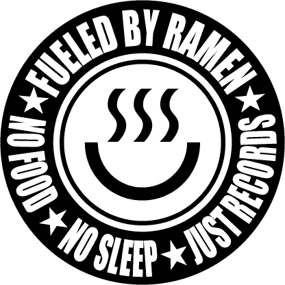
fuelled by ramen
"Since its official inception in 1996, Fueled By Ramen Records has been less of a record label than it has been a brand for the evergrowing community that has embraced what the label stands for. The label has become the nucleus for today’s best and brightest punk-inspired rock/pop bands. Originally based in the college town of Gainesville, Florida, Fueled By Ramen now calls New York City home."
Fuelled by Ramen is a record label that focuses on various genres of rock and alternative music. Notable artists of theirs include, Twenty One Pilots, The Front Bottoms and ONE OK ROCK. The label was co-founded by Vinnie Fiorello from Less Than Jake. The logo itself is similar to that of Converse, a brand associated heavily with skate culture and the kind of music fuelled by ramen produce. Furthermore, the text on the logo stresses the importance of music above all else which is a message that would be appreciated by members of the alternative subculture that the label target.

lab* records
Lab* Records are an indie label based in manchester, they focus on signing young up and coming talent. They focus mainly on indie and acoustic artists such as Fort Hope and Bethan Leadley, they reach a significant audience by often finding means to get supporting shows for their artists with larger names in a similar genre. For example i saw Fort Hope life at a concert with Max Raptor and Fearless Vampire Killers and now they are significantly more well known. The minimalism and simplicity of the logo, the use of lowercase and the asterisk all has playful youthful connotations which appeals to the young adolescent target audience of up and coming indie artists.